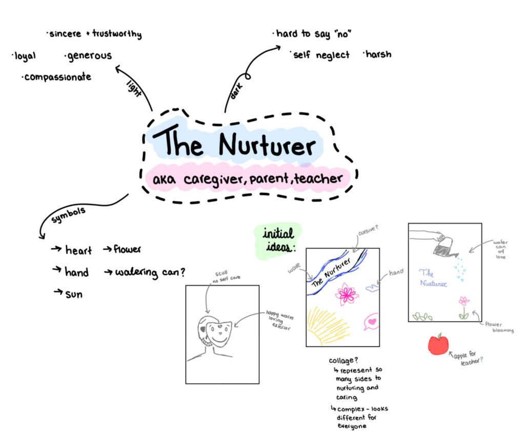
Archetype Card
For our first project, we were tasked with creating artwork based on an archetype that we felt best represented our personality. After researching various archetypes, I found myself most drawn to “The Nurturer.” Below, you’ll find an image of my final piece, a description of its characteristics and design choices, as well as some preliminary sketches and brainstorming ideas.
Positive characteristics
I am supportive, trustworthy, compassionate, loyal, and warm. I offer shoulders to lean on, hands to uplift, ears to listen, and a heart full of love. My presence brings comfort and fosters growth, and I consistently go out of my way to help others.
Shadow characteristics
My dedication to caring for others can sometimes lead to neglecting my needs, leaving me drained and overwhelmed. Additionally, there is a risk of becoming overly involved in others’ lives, which can create dependency and hinder others ability to grow independently. I find it challenging to balance my own well-being with my desire to care for others.
Imagery
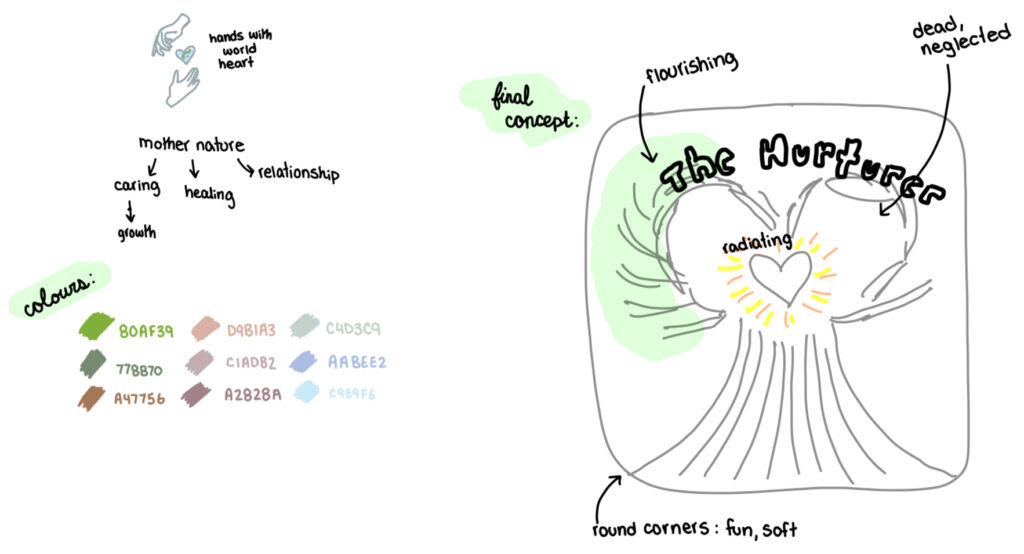
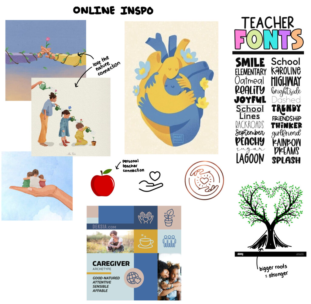
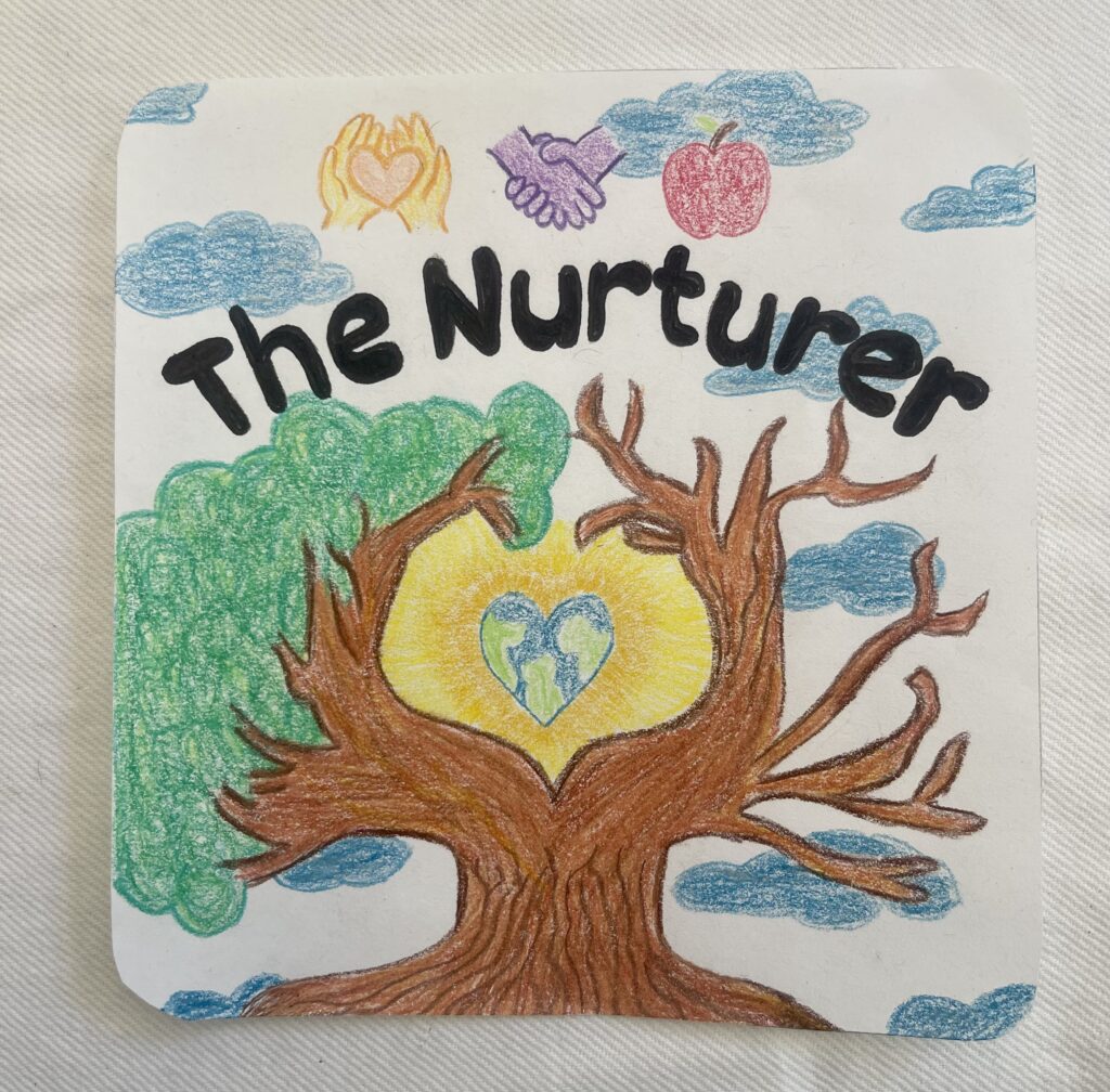
I chose a mature tree as the central image to show the deep strength and wisdom of caregivers. Incorporating nature and the earth was important to me as it signifies the interconnectedness of everything and how a nurturer’s role is to care for the natural world, not just people. While one side of the tree is flourishing, the other is struggling, symbolizing how caregivers often neglect self-care in their dedication to others. The hands in the design represent nurturers’ protective and supportive nature and the trust they build. The apple refers to my background as a teacher and how teachers are naturally nurturing, offering knowledge and nourishment, just like fruit from a tree.
Colour
I chose bright, happy colours for my archetype card because they symbolize a nurturer’s role as a positive light in people’s lives. As a teacher, I embody nurturing qualities, and the vibrant colours reflect my ability to nurture growth, positivity, and warmth.
What I like
I like how the visual elements and colours come together to convey the essence of the nurturer archetype. The design feels inviting and resonates with my role as a teacher. I like how the combination of bright colours and natural elements effectively communicates feelings of warmth and positivity.
Challenges
I found it challenging to figure out how to represent the shadow characteristics in my design. While I aimed for an overall light and happy feeling, I also wanted to convey a clear sense of imbalance. It was important to show that while the act of nurturing brings joy and support, it can also create a strain if self-care is overlooked.
Inspiration
Connecting with nature, especially Mother Earth, was a significant source of inspiration. This idea adds a deeper meaning to the design, reflecting my nurturing role both in the classroom and beyond. Teaching and nurturing remind me of gardening; just as some plants require more attention and water than others, so do some students. It’s all about finding that balance and understanding the unique needs of each individual.
Brainstorming/progress work