Ideographic Typography
This second project examined text and image relationships. Below is my final design, write-up, and some in-process work.
The option I chose was…
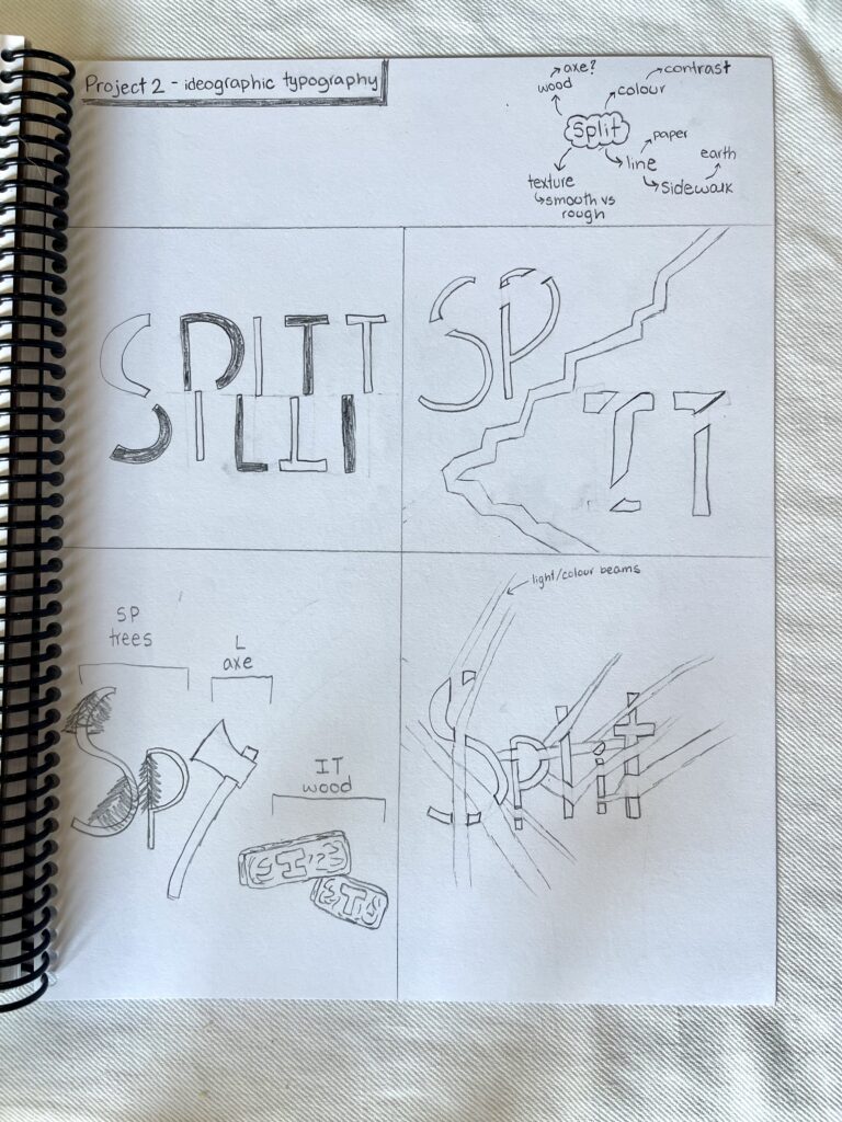
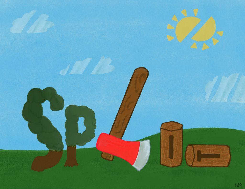
For this second project, I chose Option B to create a graphic pictorially describing a word’s meaning. (Sort of like a visual onomatopoeia.) I chose the word split.
I chose it because…
I chose Option B because I was interested in the mix of words and graphics. I had already done work like Option A (pictorial name illustration) before and wanted to try something new. I considered a few words but finally chose “split” because I had some fun ideas on how to design it (see my initial sketches!). Also, “split” is five letters long, which felt just right for the project and allowed for some cool design possibilities.
I chose this imagery and colour scheme because…
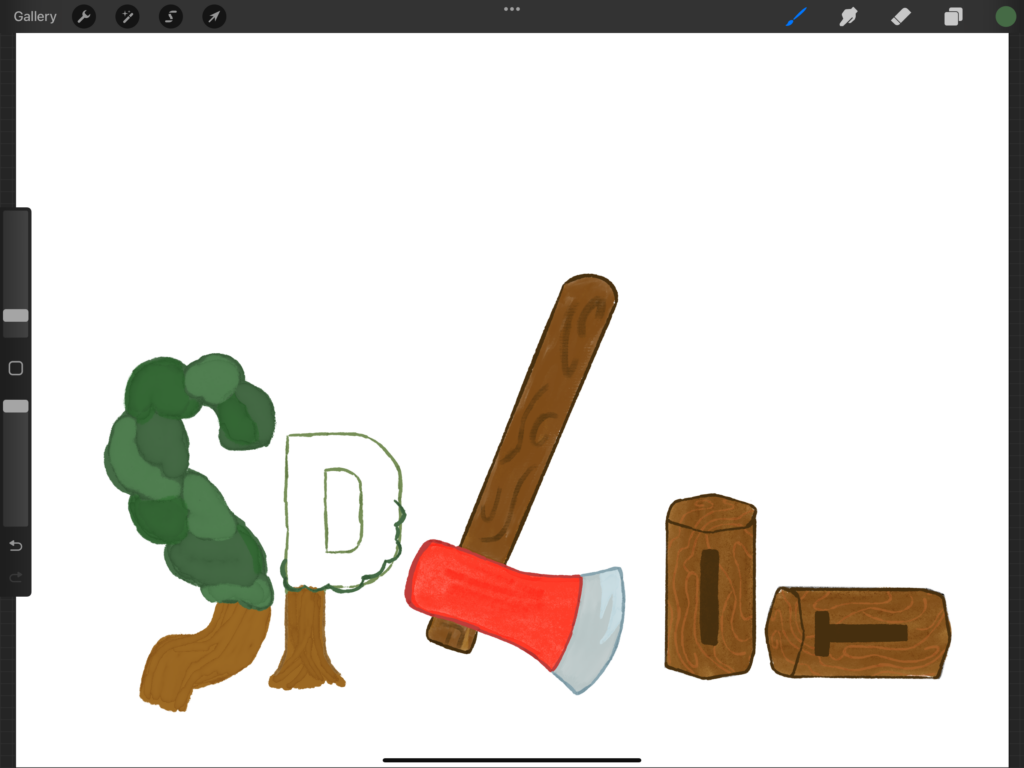
While brainstorming, I considered various real-life “splits” – from dividing a restaurant bill to splitting ends in hair to anything halved. Ultimately, I chose the image of an axe splitting wood because it felt playful and evocative. It reminded me of summers at my friend’s cabin, where splitting wood for the fire is a fun tradition. This connection to the outdoors and personal memories made the image especially meaningful.
When it comes to choosing colours, I’m drawn to brighter, happier hues. (See Assignment 1!) Since I don’t feel particularly confident in my art, selecting colours that make me happy helps make the process more enjoyable. I thought adding a bright red for the axe in the middle would create a striking pop of colour and contrast nicely with the earthy browns, greens, and blues in the rest of the image.
The Es, Ps, and Image Development strategies that feature in my design are…
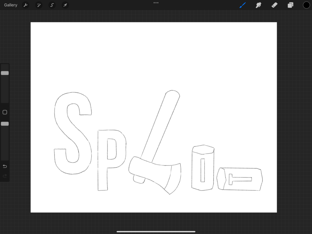
My design incorporates various elements and principles of art, as well as image development strategies. For elements, I used different types of lines, from the straight split lines to the curvy lines of the trees. Some lines are in the foreground (the trees and blocks), while others make up the background. I also incorporated different shapes, contrasting the organic elements like the clouds and trees with the man-made axe in the center.
Regarding principles, I used emphasis and dominance to highlight the axe. This was achieved through its size (making it large), colour (sharp red), and location (centred in the design). I also tried to consider unity in my design. Although everything shares a similarly bright colour palette, the varied textures and details keep it from looking boring.
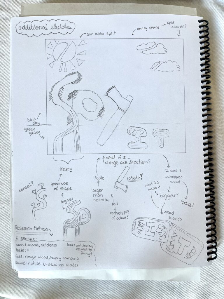
Finally, I used a few image development strategies in my design. The first is fragmentation, which is evident in the split sun and clouds and ties into the theme of the design. I also used exaggeration by making the axe larger than the trees. This not only makes the axe stand out but also adds a humorous and interesting element to the piece. Another strategy I used was reversal. Initially, I had the axe facing the other way (like an inverted upside-down L shape), but I decided it fit better facing downwards to create a clearer L shape.
What I like about this work is…
What I like about this piece is the use of digital illustration. I went back and forth on what medium to use. It was my first time creating an ink style design on my iPad. I like how some of the lines are softer and less precise compared to traditional digital work, as I have done in Photoshop before. I also like how the theme of “split” is reflected in the background with the divided clouds and sun. Additionally, it is special that the image tells a bit of a story, starting with the full trees on the left and then showing an axe cutting them into the logs on the right.
What I found challenging about this work was…
Figuring out digital ink brushes was challenging at first. I had to consider many variables, like the pressure I applied, the opacity, and the brush size. While I’m not an expert yet, I think I did well despite the difficulties. Another challenge was overcoming my perfectionism. Sometimes it’s hard for me to start a project because I’m afraid of making mistakes. Doing preliminary sketches helped because I knew I could change and evolve my ideas without worrying about being perfect from the start.
I was inspired by…
I was inspired by the memory of splitting wood at my friend’s cabin. We’ve been talking about it recently and planning a trip for when my summer classes are over. It felt like a fun and unexpected way to represent the word “split.”
Brainstorming/progress work